
Dark rooms can feel smaller than they are. The fix is not always a full makeover. Often, the quickest change comes from adding light-toned wall art in the right place, at the right size, with the right lighting. Cream and ivory are strong choices because they read soft and warm, yet they still help a room look brighter.
This guide covers how to pick cream and ivory canvas prints, where to hang them, and how to use lighting so your walls look lighter without turning the room cold or flat.
Why Cream and Ivory Work in Low-Light Spaces
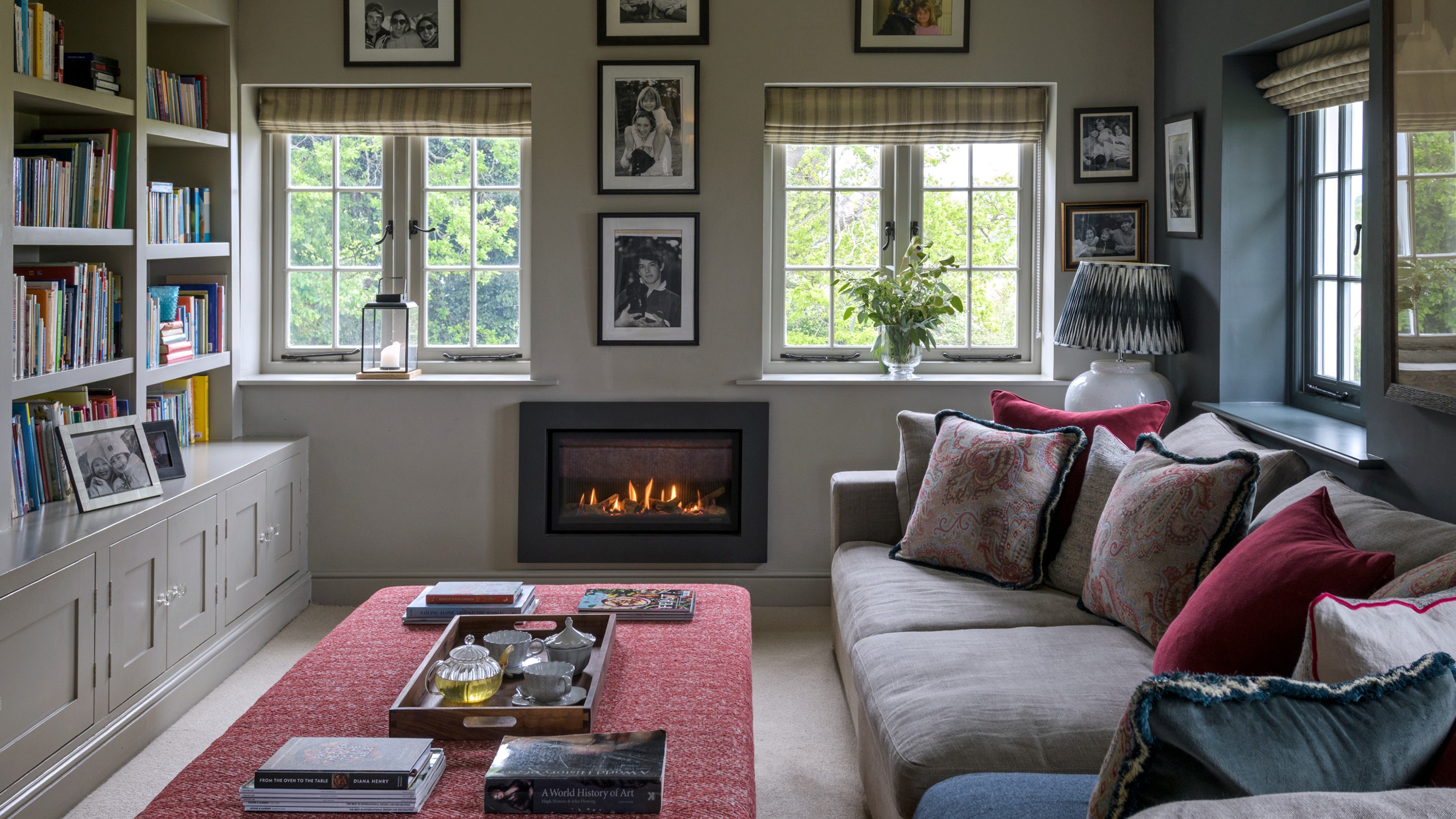
Light colors bounce more light than dark colors. In rooms with limited daylight, every reflective surface helps. A cream or ivory background in wall art can act like a gentle light-returning area on the wall, helping shadows look less heavy and corners feel more open.
What makes a room feel dim
- Window limits: a shaded view, heavy curtains, or a small window can reduce daylight.
- Shadow zones: corners, long hallways, and areas far from windows stay dark even at midday.
- Dark finishes: deep paint, dark rugs, and bulky furniture absorb light and lower the room’s overall brightness.
Cream vs. ivory: a quick undertone guide
Cream leans warm. It pairs well with wood tones, warm metals, beige textiles, and soft tan paint. Ivory looks cleaner and pairs well with stone, light gray, and black accents. If your walls are cool-toned (gray, slate, blue), ivory usually blends well. If your space leans warm (tan, caramel, oak), cream often looks more natural.
Start With a Simple Light Check
Before you choose art, do a quick scan of how light moves in your room. This helps you avoid hanging a light-toned piece in a spot that never gets any light at all.
The 5-minute light test
- Stand in the room in the daytime and note where daylight lands on the walls.
- Turn on your evening lighting and note where shadows stay.
- Pick one wall that gets the most consistent light (day or night).
- Pick one dark corner that needs help and plan a lamp near it.
When your goal is a brighter look, you usually get the best result by placing cream or ivory wall art where it receives side light from a window or a nearby lamp. That’s when the surface can bounce light back into the room.
Choose the Right Look for Cream & Ivory Wall Art
In darker rooms, contrast and scale matter. Tiny detail can disappear at a distance. A clear design with a light background reads better and contributes more to the “lighter wall” effect.
Styles that look bright without looking blank
Look for designs that use light backgrounds, soft mid-tones, and a small amount of deeper color to define shape. These often work well:
- Abstract wall art with large shapes and gentle contrast
- Line-based artwork on an ivory ground
- Nature scenes with light skies, sand, or misty hills
- Black-and-cream photography with a matte look
If you want a clean, light-first look, browse neutral abstract wall art and focus on pieces where cream or ivory is the main background.
Common mistakes to avoid
- Too small on a large dark wall: tiny art can get lost and make the wall look heavier.
- Too busy in a narrow space: complex patterns can feel noisy in hallways and entryways.
- All light, no structure: a piece that is only pale tones may look washed under evening lamps. A little dark line work helps.
Lighting + Placement: Get the Bright Room Effect
Wall art can only reflect the light that reaches it. Placement is less about a single “perfect height” and more about putting the piece where daylight or lamplight can touch it.
Daylight placement tips
Hang cream and ivory wall art on a wall that faces the window or sits at a right angle to your main daylight source. This helps the canvas catch light rather than sit in full shadow. If you hang art directly opposite a bright window, check for glare and shift the piece slightly to the side if needed.
Evening lighting that helps (without harsh shine)
In dark rooms, aim for at least one lamp that throws light across the wall rather than straight up. A floor lamp near a corner can wash the wall with soft light, making cream and ivory tones look warmer. If you use framed art prints, a matte finish is often easier to live with than glossy glass.
Size and Layout That Actually Works
Scale is one of the fastest ways to make a dark room feel lighter. A larger canvas print creates a bigger light-toned area on the wall, which helps the room feel more open.
Pick a size that matches the furniture
Use these rules as a starting point:
- Above a sofa: choose art that is about two-thirds to three-quarters the width of the sofa.
- Above a bed: keep the art wide enough to balance the headboard, but not wider than the bed frame.
- Over a console: one large piece or two pieces with consistent spacing works best.
One large canvas vs. a set
A single large piece often reads calmer in a darker room. A 2–3 piece layout can also work if the gaps are consistent and the backgrounds stay mostly cream or ivory. Keep spacing steady so the set reads as one strong light zone.
Room-by-Room Hanging Ideas
Use room function to guide placement. The best spot is where people spend time and where light already moves through the space.
for Living Room
Place a large cream canvas print above the sofa or on the main wall you see when you enter. If the room has a dark corner, hang the art there and add a floor lamp nearby to brighten that zone.
for Bedroom
Light-toned wall art above the headboard can make the room feel calmer. If the bed wall is very dark, choose a wider piece with an ivory background and a small amount of deeper detail so the design stays clear at night.
for Hallway and for Entryway
In narrow spaces, a vertical canvas print can lift the wall without taking over. If you prefer a small gallery run, keep frames consistent and use cream/ivory pieces as the “anchors” between darker works.
for Home Office and for Office
Behind the desk is a strong place for light-toned art because it sits in your line of sight. For a work-ready look that keeps the wall brighter during long days, consider office wall art in cream and ivory tones.
for Dining Room and for Kitchen
Keep wall art away from heat and steam. Over a sideboard, bar cart, or breakfast nook works well. Choose a canvas print (instead of glass) if the area gets fingerprints or splashes.
Color Pairings That Help Cream and Ivory Stand Out
Cream and ivory work with many palettes, but the surrounding colors decide whether the art looks bright or dull. Pair light-toned art with finishes that create a clear outline.
Pairing with dark walls
- Charcoal and soft black: strong contrast that makes ivory look crisp.
- Deep navy: keeps the room rich while the art adds light.
- Forest green: looks natural with cream, especially with wood accents.
Pairing with light walls
On pale walls, choose cream and ivory pieces that include darker line work or a muted accent color so edges don’t disappear. A thin black frame can define the shape without making the room feel heavy.
Canvas Print vs. Art Print: What to Pick for Dark Rooms
Both formats can work, but they behave differently in low light.
Why canvas prints often feel easier
Canvas tends to show less glare than many framed prints. In a room that relies on lamps, that can help. The surface also reads well from across the room, which supports using a larger size to brighten the wall.
When an art print makes sense
Art prints can look very sharp. If you love crisp detail, pick a matte finish and place it where lamp light won’t hit the glass straight on. For soft landscape scenes, a matte print can look calm and gentle.
For light skies, sand tones, and airy scenery, explore a nature canvas print that keeps cream and ivory as the main color family.
Care Tips for Light-Toned Wall Art
Light backgrounds show dust sooner, but care is simple. Use a clean, dry microfiber cloth for light dusting. Avoid wet wipes and strong cleaners. If you hang art in a kitchen or near a busy doorway, choose a spot that won’t get touched often.
Quick Checklist Before You Buy
- Measure the wall and the furniture below it.
- Choose cream (warm) or ivory (clean neutral) to match your room’s undertones.
- Pick a size that reads well from where you sit or walk.
- Plan a lamp position so the art gets light in the evening.
- Keep contrast in mind: a little darker line work or a thin frame helps definition.
Conclusion
Cream and ivory wall art can brighten a dark room when you focus on placement, scale, and lighting. Choose a light background with clear structure, hang it where light can reach it, and use a lamp to support the look after sunset.